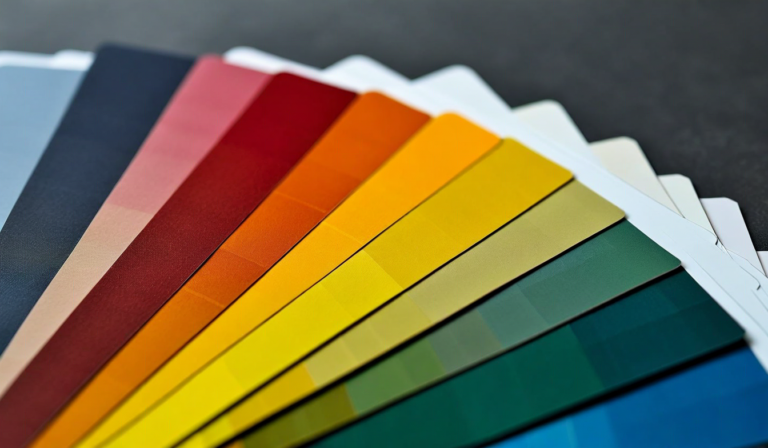
Color psychology in design is a field where the claims are often much larger than the evidence supports. The assertion that "blue builds trust" or "red creates urgency" is repeated so often in design writing that it has acquired the status of fact. The actual research picture is more nuanced, more context-dependent, and more interesting than these simple rules suggest. This article covers what color psychology actually delivers for digital designers — and how to apply it productively.
Understanding the real and the overstated effects of color allows designers to make better decisions: using color where it demonstrably helps, and not overthinking color choices where the evidence for specific effects is weak.
What Color Psychology Actually Demonstrates
The most robust finding in color psychology research is that color affects attention. Warm colors — reds, oranges, and yellows — are more visually salient than cool colors at equivalent saturations. This is not a universal rule (a saturated electric blue catches more attention than a muted orange), but all else being equal, warm hues command more of the visual field. This has direct implications for how digital designers should use CTA buttons, alerts, and other attention-critical elements.
Color constancy and contrast are also well-established. Elements in high contrast to their background receive more visual attention than elements in low contrast. This is partly a color effect and partly a luminance effect; both matter for UX design. The practical implication: interactive elements that need to drive action should have high contrast against their background, regardless of which specific colors are used.
Color associations are real but heavily mediated by culture, context, and individual experience. Red is associated with danger in Western contexts, with luck in Chinese cultural contexts, and with passion in romantic contexts. These associations influence emotional response — but they are not deterministic, and they shift with context. The color of a "Buy Now" button matters less than its placement, size, and the clarity of the value proposition it is attached to.
The most methodologically reliable finding in digital color research is about consistency: interfaces that use color consistently — where color reliably signals interactive elements, the same color always means the same thing, and color coding does not change between sections — perform better on task completion and user satisfaction metrics than interfaces that use color inconsistently, regardless of which specific colors are used.
Color as an Attention and Hierarchy Tool
In digital UI, color's most reliable function is hierarchy management — using color to signal what is most important on a page or screen, and what is secondary. This works because human vision is drawn to chromatic contrast; an element in a distinct color stands out from a field of neutrals even when it is not the largest element.
The single-color accent approach is a practical hierarchy framework: use near-neutral tones for the majority of the interface (backgrounds, text, secondary elements) and reserve one accent color for primary interactive elements — primary CTAs, selected states, active navigation items. When only one element on a screen uses the accent color, that element draws attention reliably. When the accent color appears everywhere, it loses its attention-drawing function and becomes background noise.
Color can reinforce hierarchy that is established by other means (size, weight, position), but it is less reliable when used as the sole hierarchy signal. Color-blind users experience color differently; approximately 8% of men and 0.5% of women have some form of color vision deficiency. Designing hierarchy that depends entirely on red vs. green distinctions, or on specific hue differences, creates barriers for this audience. Color should reinforce hierarchy that is also communicated through shape, position, or typographic weight.
Color-coded information — charts, maps, status indicators — is a powerful data communication tool when implemented correctly. The key requirements: use color palettes designed for accessibility (tools like ColorBrewer provide research-based accessible palettes for data visualization), provide text or icon labels as secondary channels for users who cannot distinguish colors, and avoid using red and green as the sole signals for pass/fail states.
Emotional Valence and Brand Color Choice
The evidence for specific color-emotion linkages is real but smaller in effect size than most design writing implies. Studies do show that warm colors are associated with higher arousal states, cool colors with lower arousal states — energized vs. calm, active vs. passive. This broad spectrum is more reliably supported than specific mappings like "orange means creativity" or "purple means luxury."
For brand color selection, the more practically reliable approach is competitive differentiation. In most product categories, established players have claimed certain color territories. Technology companies cluster around blues; health and wellness brands cluster around greens and teals; financial services brands use conservative blues and dark grays. Choosing a color that is distinct from competitors in your category creates category differentiation that is more reliably useful than attempting to engineer specific emotional responses.
Saturation and lightness affect emotional valence more reliably than hue. High-saturation colors feel energetic and bold; low-saturation colors feel restrained and professional. Light values feel open and fresh; dark values feel sophisticated and immersive. These saturation and lightness effects are more consistent across cultures than hue associations and provide a more reliable framework for matching color character to brand personality.
The appropriateness heuristic — does this color feel right for what this brand does and who it serves? — is less pseudoscientific than it sounds. It is a summary judgment that aggregates cultural associations, competitive context, and category conventions. The most important test is whether your target audience finds the color appropriate and relevant; this is better measured through user research than through reference to color psychology rules.
Color Contrast and Accessibility
Color contrast in digital design is both a functional and a legal concern. Web Content Accessibility Guidelines (WCAG) specify minimum contrast ratios for text and interactive elements. The AA standard requires a 4.5:1 contrast ratio for standard text and 3:1 for large text; the AAA standard requires 7:1 for standard text. These are not design preferences — they are measurable requirements that determine whether a significant portion of your audience can read your interface.
Many brand color combinations that look visually appealing fail contrast requirements. Brand pink on white, light gold on white, medium blue on medium gray — these combinations are frequently used and frequently fail WCAG. Checking contrast ratios with tools like the WebAIM Contrast Checker should be standard practice in any digital design workflow, not an afterthought.
Dark mode has complicated the contrast landscape. A color palette designed for light mode may have adequate contrast on white backgrounds but fail on dark backgrounds. Design systems that support dark mode need explicit contrast specifications for both modes, not just one. The most efficient approach is to define a set of semantic color tokens — primary-text, secondary-text, background, surface, interactive — and specify the value for each token in light and dark modes, then test both.
Practical Color Decision Process
A practical color decision process for digital design starts with three questions: What does this color need to communicate? Where will it appear, and what does it need to stand out from or blend with? Does it meet contrast requirements in all contexts where it will be used? These three questions filter out most color choices that will create problems in implementation.
For brand primary colors, add the question: how does this color position against competitors? A distinct, ownable color in your category is worth more than a psychologically correct color that three of your competitors also use. Distinctiveness supports brand recognition; psychological correctness (to the extent it is real) provides marginal conversion effects that are hard to isolate from other variables.
Color testing in digital design is underused. A/B testing different accent colors on CTAs, testing different background colors for landing page sections, and measuring outcomes rather than relying on design intuition or color psychology rules will produce more reliable guidance for your specific audience than any general principle. Color is testable; when the stakes are high, test it.